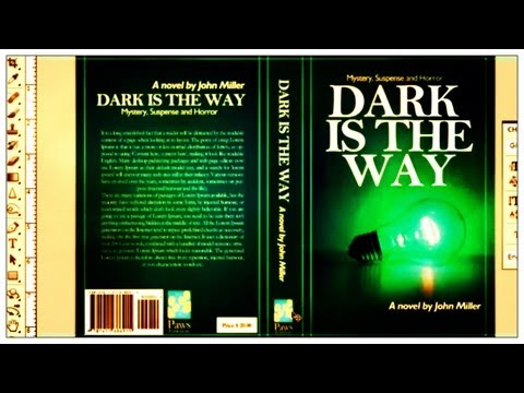
                                                  Text is yet another very important feature when it comes to making a book cover. Sure you may have the perfect image, but if the text looks as if someone has scribbled on your masterpiece then it's not going to look very attractive. For me the text is probably the hardest part to get right. Here are a list of things to consider for your text when designing a cover:
                              ○ How do I make the text fit with the image? (Do you have space above your image or under it to place the text? Or do you want the text going right across the image? If you don't want to cover the image then I suggest you try making some space above or below, but don't worry too much about that for now as I'll explain this later.)
                              ○ What style do I want my text? (Cursive, plain, emboldened, italics, font and so on.)
                              ○ What colour do I want my text? (This is often quite hard to choose since it needs to either fit in with the colours used in the rest of your cover or it needs to stand out from the image. Quite often I find myself playing around with different colours for the text and I even apply gradients or patterns to the text which I will explain later.)
                              ○ How big do I want my text to be? (Do you want the text to stand out or not as much? This also depends on how long your title is. If you have only one or two words you can make the text quite big and even put the words on separate lines. If you have, say, five or six words you might want to make some of the text quite small to fit a few words on one line and then the other words can be larger beneath that line. The cover for this book is a perfect example of that.)


                              So make sure you always ask yourself these questions when you are designing a cover. You can often find fonts that relate with the image on your cover, but try and keep the fonts more professional looking as this makes the cover look more attractive. If you don't have many fonts you should try downloading some from the websites below. I've probably downloaded hundreds of new fonts by now:
                              ○ DaFont
                              ○ Font Squirrel
                              ○ 1001 Fonts
                              ○ Fonts.com


                              Another few things I should mention about text is that you shouldn't use more than 2 or 3 different fonts. Personally I only use 2 (One for the title and one for the author's name and subtitle.) I also add spacing in-between letters when typing the authors name to spread it out more and I always make the font of a subtitle (if there is one on the cover) smaller than the font of the author's name. You should always remember that when you are choosing a font, it must be clear and easy to read. People viewing the cover don't want to be wasting their time trying to figure out what the title says. The video above is how to make a book cover in Photoshop. The guy speaks quite fast but he gives some good tips and it's a good tutorial if you are wanting to make a back cover as well as the front. If you have any questions about this section please feel free to message me.

YOU ARE READING
How to Make a Good Book Cover
RandomTips and tricks to making a good book cover. Video tutorials included.


