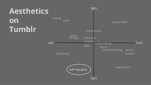
                                              I know in the picture that soft macabre is circled, but that's just how I found it. Also, soft macabre is one of the more famous ones.
                          Most of the aesthetic blogs are up on that chart.
                          So I'm going to summarize and give you an idea of the aesthetic blogs up on that chart if you aren't familiar with it. Feel free to correct me. I just looked up pictures on our good ole' friend Google, and I am observing these blogs and telling you their summaries. Enjoy!
I'll start with the lighter ones.
                          1. Kawaii has some what of a childish feel to it. I found that a lot of these blogs are ran and amused by anime watchers. Kawaii is also Japanese so they have their animations included.
Feel: cute and childish and happy
Colors: pink, purple, white
                          2. Pale is a "weirder" one. I find it one of the weirder ones, at least. It includes mainly grids and blue and black themes. It seems kind of emotional, and it's pretty hard to summarize.
Feel: sad, emotional
Colors: blue, black, white, red (blood), darker colors
                          3. Indie vintage is also like pale, but it has more of a black and white, my as much blue. It also has a lot of fog and light colors. This one also seems sort of emotional, yet original.
Feel: sad, emotional
Colors: light and dark contrast, b&w
                          This next one is harder on the chart.
                          4. Vapor wave (yes, it's on the line so I put it on this side) generally has a lot going on in the picture. It does include grids and checkerboard themes, and statues and Japanese or Chinese are included. This is definitely a "weirder" one as well. It's almost as if the people making the edits were feeling emotional.
Feel: grungy, punk-rock almost, emotional
Colors: dark colors with white included
                          5. Pastel goth is also very anime-heavy. It has that Japanese animation included, and is also difficult to explain.
Feel: emotional, punk-rock, punk
Colors: pink, white, black, grey, purple
                          Darker is the next one.
                          6. Urban/skate is also difficult to explain. I would say it's name is pretty self-explanatory.
Colors: black and white, basic colors mixed together
                          7. Band is weird to me I really can't explain it.
                          8. Tattoo/piercing is also self-explainable. It may include the lines and grids.
Feel: grungy, punk, rebellious
Colors: dark usually
                          9. Social justice has very natural photos, and can be weird. It is also hard to explain.
Feel: punk
Colors: either really exotic/ vibrant, or really dark.
                          10. Depression is that really sad one that everyone tries to skip but sadly some do not. Overall, it's just a really big sad face :(
Feel: sad, emotional
Colors: gray, black, white
                          This is the soft portion.
                          11. Soft grunge is kind of creepy to be honest. It has a lot of personal and emotional photos that i can't describe through words.
Feel: eerie, sad, emotional, creepy
Colors: skin, bruises, light colors
                          12. Soft macabre is the nope section of tumblr that you avoid once it's past midnight.
Feel: scary, creepy, eerie
Colors: black, white, grey
                          13. Black and white is very self-explainable. It is also very creepy, and kind of like soft grunge. This shows the clouds, guns, people running away, the moon, handcuffs, etc.
feel: creepy
Colors: b&w obviously.
                          And now for the last one:
                          14. Anime and cosplay is honestly just anime and cosplay. Nothing more nothing less. There's no feel or colors that are specific enough for this because it's all just anime and cosplay.
                          That's all I have for this chapter! Vote and comment!

YOU ARE READING
A Guide of Tumblr
Humor*deep sigh* - this book is NOT meant to be offensive - meant to be funny or informational? - don't get butt hurt :-) - you can always ask me questions about anything you see in my book

